Legion Pages
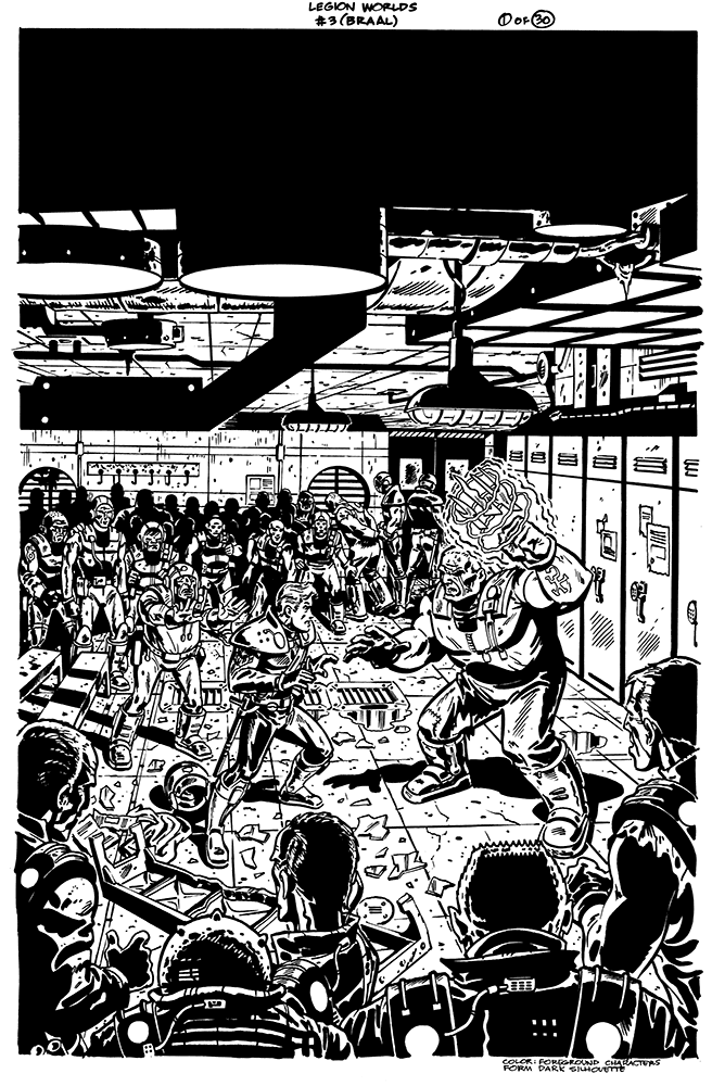
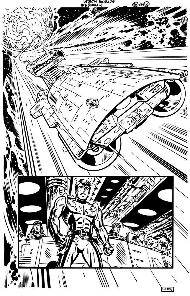
The first and last pages of a 30-page story I did for "the Legion of Super-Heroes"...I didn't keep scans of the pencils, or else I'd post them...
posted by Paul Rivoche at 2:37 PM
![]()
![]()

posted by Paul Rivoche at 2:37 PM
![]()
![]()

I love being a channel for creativity and since roughly 1979 I've been creating comics covers and pages, graphic novels, animation background designs, illustrations, and more.


4 Comments:
No they allowed a lot longer Warren...sometimes they have a shorter deadline like that but, especially if you're both pencilling and inking, they usually schedule further ahead, as far as I know. In this case they was I think three or four months. I still got in a bit of trouble, barely making the deadline, since I was loaded up with other work too, not doing comics full time. I learned a lot though, not only about doing the pages, but more importantly I learned that I didn't want to draw mainstream comics! You have very little control, and it's a lot of work for little pay, compared to boarding or agency work etc...now I'm only interested in drawing my own comics, for bread and butter i'd much rather do ad art, as heretical as that probably sounds to die-hard comics types...to me drawing mainstream comics is just another type of commercial job now, except it ranks near the bottom of the hierarchy...
It was issue 3 (out of a total of 6 issues) from a mini-series called "Legion Worlds" from DC comics of course, the issue was cover dated August 2001. Unfortunately I don't feel the color served the pages very well, he said trying to be charitable, so you may be disappointed with the final result...if you do manage to track it down.
I'll see what I can dig up on the Mister X stuff...
Great looking pages, I love that shot with the ship... Your use of darks inspires me, throwing blacks across a page is not easy to do for many people...
Thanks for the comments everyone!
Busted, I think you nailed it...too many colorists aren't willing to serve the story, they want to star...and in so doing, fall down. They don't read the story and the compositions and work to augment those; often they go against them, then there's a clash...good color is really demanding, to find the line between too much and too little.
Dik, about blacks, I try to study the greats, they manage to tiptoe the line between "too realistic but loses the design" and "too designy and loses the realism". That's why I love Noel Sickles, Toth who followed his lead, Caniff, Frank Robbins...those guys understood literal lighting, but alos how to modify it carefully to suit the page design, and doing it so skilfully your eye doesn't really notice...for example Toth, he's actually far more cartoony than it amy seem at first glance. His lighting looks "real" but when you break it down, he's taken all kinds of liberties...in a good way of course...
Warren, yep, Pitzer was great to work with, and there's a lot of promise in anthologies and the fact that mainstream book publishers in the US are jumping on the graphic novel bandwagon...
Post a Comment
<< Home