Sunday, September 25, 2005
About Me

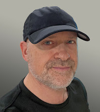
- Name: Paul Rivoche
- Location: Toronto, Ontario, Canada
I love being a channel for creativity and since roughly 1979 I've been creating comics covers and pages, graphic novels, animation background designs, illustrations, and more.


4 Comments:
Very cool...
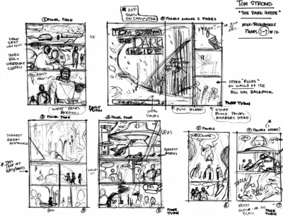
I find that I am not a good thumbnailer, I tend to always draw more detail than I need to in my thumbs (get caught up in the drawing), I am constantly trying to get draw quicker so the ideas can flow more easily... constant struggle between speed and readability...
The problem you mention is the exact reason to do mini-thumbnails: if the drawing is tiny , it's literally impossible to load up on detail or else it just becomes indecipherable. if you draw mini thumbs you can just focus on drawing tiny silhouettes for things and the basic symbols, that's all you really need, a kind of shorthand.
the thing i always enjoy about your pages is the flow from one panel to the next. Its really noticeable in these thumbs. especially on that large page.
Hi Marco and Warren. Warren, my answer to your question is: a bit of both. On one hand I definitely studied and tried to figure out how best to design a page---a difficult subject with which I still struggle for sure. On the other hand the more you practice the more it, yes, does become somewhat internalized---you tend to "see" more quickly what visual solution will work, and what is a waste of time. But at first you have to go down a lot of blind alleys and wander around a bit, which is another one of many good reasons to do mini thumbnails: you don't waste a lot of time doing a whole bunch of "fancy drawin'" only to have, agonizingly, throw it out once you realize it doesn't work.
I do a lot of re-drawing and doodling and attempting at the "mini" stage, stumbling around until it becomes clear what will work. On a golden day it might come right away, other days it's a fight...but if you can't solve it small, no amount of large fancy drawing and detail will ever make it work!!
I study Roy Crane, Alex Toth, Kirby, etc, superb masters of page design and eye flow. They all understand perfectly well how to propel and control the viewer's eye and move it through the page. it's all ther on their pages once you learn to see beneath the skin and discover what it is they are doing. It's not an exact science, no, but can be learned once you identify what it is you're after.
Hopeully I'll get a moment to write on this at more length over on "The Scientific Artist"....
Post a Comment
<< Home